Navbar without Search
to use this navbar you need to add id="fullscreen-nav" to the body
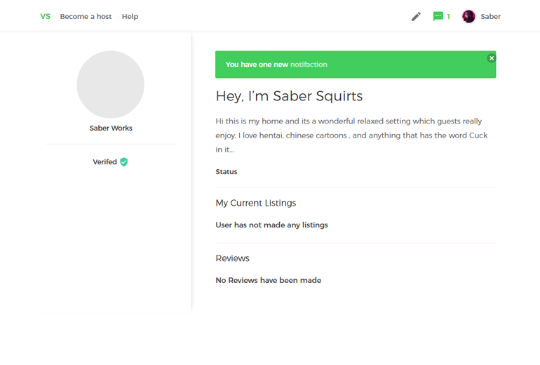
Add this just bellow the body. This Navbar block will be used thought site and always goes after the bodyand before the container
Navbar Block
<section class="hero is-medium">
  <!-- Hero header: will stick at the top -->
  <div class="hero-head">
    <header class="nav">
      <div class="container">
        <div class="nav-left">
          <a class="nav-item logo">VS</a>
          <a class="nav-item is-hidden-touch">Become a host</a>
          <a class="nav-item is-hidden-touch">Help</a>
        </div>
        <div class="nav-right nav-menu fullscreen" id="nav-menu">
          <a class="nav-item is-hidden-tablet ">Create Listing</a>
          <a class="nav-item is-hidden-tablet">My Profile</a>
          <a class="nav-item is-hidden-tablet">My settings</a>
          <a class="nav-item is-hidden-tablet has-notify"> Logout <i class="material-icons ">exit_to_app</i></a>
          <a class="nav-item is-hidden-tablet">Help</a>
          <a class="nav-item is-hidden-tablet">Become a host</a>
        </div>
        <div class="nav-right nav-profile">
          <a class="nav-item is-hidden-touch">
            <i class="material-icons">create</i>
          </a>
          <a href="../profile/notifications.html" class="nav-item has-notify">
            <i class="material-icons">sms</i>
            <span>1</span>
          </a>
          <a class="nav-item profile is-hidden-touch">
            <figure class="image is-32x32">
              <img src="https://puu.sh/uYwJ0/18df19e23f.jpg">
            </figure>
            Saber
          </a>
          <a class="nav-item profile is-hidden-desktop" id="nav-toggle">
            <figure class="image is-32x32">
              <img src="https://puu.sh/uYwJ0/18df19e23f.jpg">
            </figure>
          </a>
          <div class="dropdown-menu">
            <a href="" class="nav-item">Create Listing</a>
            <a class="nav-item">My Profile</a>
            <a class="nav-item">My settings</a>
            <a class="nav-item">Logout <i class="material-icons">exit_to_app</i></a>
          </div>
        </div>
      </div>
    </header>
  </div>
</section>
Navbar js
This navbar demo requires jqueryand this js code below to run
$(document).ready(function() {

  var $toggle = $('#nav-toggle');
  var $menu = $('#nav-menu');
  var $mobile = $('#fullscreen-nav');


   $toggle.click(function() {
     $(this).toggleClass('is-active');
     $menu.toggleClass('is-active');
   });

   $toggle.click(function() {
     $(this).toggleClass('is-active');
     $mobile.toggleClass('disable-scroll');
     $("html").css("overflow-y", "auto");
   });

});
what is happening in the background
on mobile when you click a hrefwith id="nav toggle"
will add a class disable-scroll to the body which disables the scroll when the navbar is active
which will also add a class of is-active to the div that has id="nav-menu" which will just add display block to the div